01. Finalize the words before the design
Start with a headline you can read at a glance. Type the exact wording, capitalization and punctuation in quotation marks near the beginning of the prompt. Keep descriptive instructions outside those quotes.
Decide which words are essential and which belong in a layout tool later. A headline and a short supporting line are easier to inspect than a full menu or a dense paragraph. Our sample uses original fictional copy so you can adapt it without confusing it with a real brand campaign.
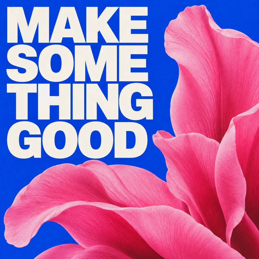
A simple two-level poster
Copyable English promptA botanical exhibition poster. At the top, the exact headline "MAKE SOMETHING GOOD" in very large ivory serif capitals. Below it, the exact subheading "A LITTLE SPACE. A NEW IDEA." in small clean sans-serif capitals. One coral-orange flower fills the lower half. Rich cobalt-blue background, generous margins, clear separation between the two text blocks.
02. Describe the hierarchy and letter shapes
Give each text block its own location and visual role: a large headline at the top, a smaller subheading below, and a small caption at the bottom. Describe visible letterforms, such as heavy condensed sans-serif, rounded lowercase letters or high-contrast serif capitals.
Treat the image as a composition brief. Specify enough empty space around the lettering and avoid placing detailed props behind essential words. A single strong typographic choice usually gives you a clearer review target than several competing styles.
03. Know when to use a design tool
Generating letter shapes is different from typesetting with an installed font. If your deliverable requires a licensed brand font, editable text, exact kerning or mandatory fine print, set that copy in a design tool and use the generated artwork as an image layer.
For multilingual layouts, proofread the exact script with someone who can read it. Do not infer Chinese character accuracy from a successful English headline. A polished composition does not establish that a word, name or accent mark is correct.
04. Edit a wrong word without rewriting the scene
When the composition is useful but a word is wrong, download it and upload it in Edit mode. Ask for the exact replacement and name the placement, color and letter style to preserve. Then compare the new lettering with the intended copy character by character.
A correction request can still fail. If repeated attempts do not produce acceptable text, keep the artwork and replace the lettering manually. This is a production choice you can review, not a reason to accept a misspelled result.
A focused lettering correction
Edit instruction · Upload your own source imageReplace only the poster headline with the exact text "MAKE SOMETHING GOOD". Preserve its ivory serif style, size, line arrangement and position. Keep the flower, subheading, cobalt-blue background and all other visual elements unchanged.
05. Proofread at the final viewing size
Review the downloaded image at full size and at the size your audience will see. Check missing or doubled letters, unwanted text, line breaks and contrast. For a print asset, review the final file in your print workflow rather than treating a browser thumbnail as approval.
These prompt examples are starting points. Their artwork is illustrative and not a guarantee of exact text rendering by Ideogram 4.5. Save the file you approve, because the API result URL is temporary.
- Match every character against the final copy.
- Check headline and supporting text separately.
- Keep essential text readable at its destination size.